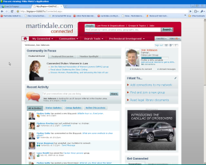
One year after its official launch, the professional-networking site Martindale-Hubbell Connected is preparing to roll out a relaunch, with a new design, new features and enhanced functionality. Well before its official launch, I posted one of the first reviews of the beta site. Since then, the site (which is owned by LexisNexis) has continued to evolve, but it has been plagued by a clunky interface that makes it difficult to navigate and sometimes difficult to use.
Today, Jon Lin, senior director of product management at LexisNexis, and Mike Mintz, community manager for Martindale-Hubble, presented a webinar preview of Connected’s redesign. They were showing a demonstration site that lacked full functionality, so it is difficult to fully assess the changes. Based on what they showed, however, it appears that the new site will be a major improvement in ease of use and navigation.
The redesign had two overarching goals, Lin said. The first was to make it so simple to use that even a child could easily understand it. The second was to create tighter and more seamless integration between Martindale-Hubbell Connected and the public Martindale.com site.
To improve navigation, the redesign incorporates a standard navigation menu with drop-down sub-menus that will appear on every page and make it easy to access the site’s various sections and features. Also, the site makes greater use of tabs on pages, with the goal of giving users access to greater varieties of information while requiring fewer clicks.
Along with better navigation menus, the new site has a much improved search bar that will appear on the top of every page. It will let you search for lawyers by name or practice area; find firms and companies; search by law schools; find groups; search discussion topics in blogs, wikis and forums; and search for jobs. In short, the search function will search for anything posted anywhere on Connected.
A user’s home page on Connected will now look more like a Facebook page in that it will feature a status update bar near the top and a Wall-like array beneath it featuring activities and updates of others in your network. Tabs let you switch this display from showing all updates to show just status, group or discussion updates.
The new design makes ample use of various types of widgets tailored to your location within the site. On your home page, one widget gives you quick access to your connections and another helps you find activity and discussions that may interest you (based on information you provide about yourself in your profile).
Enhanced Profile Pages
Among the most significant substantive changes are to profile pages. Until now, a member’s Connected profile had no direct connection to his or her Martindale.com profile. Now, the two profiles will be virtually identical with the same information. The primary difference between the two will be that Connected members will have one-click access to editing and updating their profile information.
The new profiles will be arranged in tabs, showing professional details, community posts and activity, ratings and reviews (as now appear on Martindale.com) and network connections. Users will be able to add much more information about themselves than now, including links to their other social-networking sites, Twitter feeds and multiple blogs.
A new “My Diversity Information” section will allow users to identify their gender, ethnicity, physical handicaps and identification as LGBT.
Also completely redesigned is the way the site handles and displays groups. This has been one of its clunkiest areas, so these changes are welcome news. Functionally, the biggest changes are that groups can now include multiple subgroups and that subgroups can be set up as public or private. The more visible changes are to the design of the groups directory and to specific group pages, all of which are made much easier to use and move through.
An important change for current members to note is that all information in public groups and blogs on Connected will become visible to the public — meaning nonmembers as well as members — and will be indexed by Google. This is intended to give users greater visibility. Private groups will not be visible other than to members. Users who wish to change the status of a group from public to private must do so by May 28.
The redesign is slated to launch sometime in early June.
It is difficult from viewing a webinar to fully evaluate the changes. Based on what they presented, however, the changes appear likely to improve significantly the “experience” of using Martindale-Hubbell Connected. The cleaner design and enhanced navigational elements look promising. Better integration with the Martindale.com parent site makes sense — provided Connected does not turn into a forum focusing on upselling to enhanced products and services.
 Robert Ambrogi Blog
