In a post earlier this year, I wrote about Onit, the Web-based project management tool introduced as a beta at LegalTech in February. Designed for managing projects of any size, Onit includes a Legal Edition for legal matters and cases. “The beauty of Onit is its simplicity,” I wrote then, not to mention its price tag, which is free.
Later this week, Onit will roll out a major redesign aimed at helping users focus quickly on what is most important, with a minimum number of clicks. In a sense, that simplicity I wrote about was too simple, co-founder Eric Elfman told me in an interview this week. “It was so monochromatic, it didn’t help focus people on the most important information.”
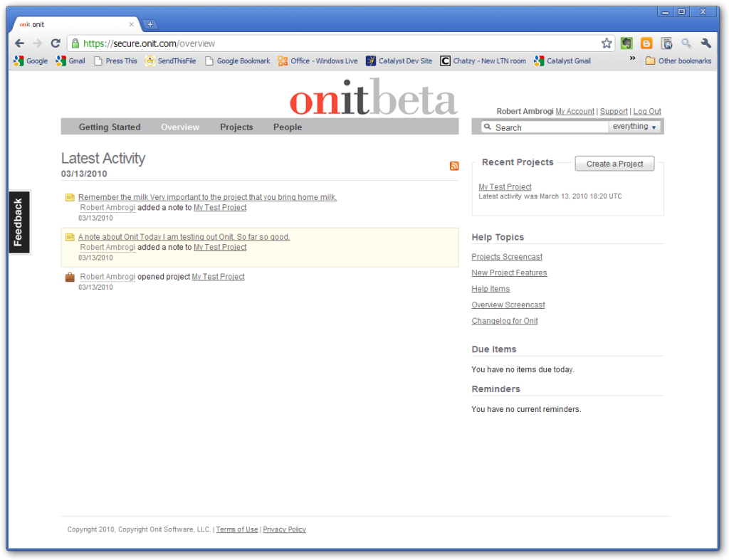
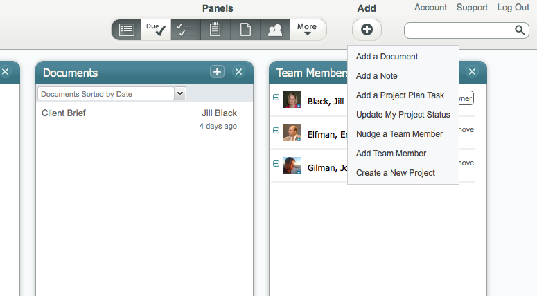
Below is a screencap showing Onit’s appearance when I tested it last March and as it still appears today. Below that are screencaps showing the new design. As you can see, the new design is a dramatically different approach.
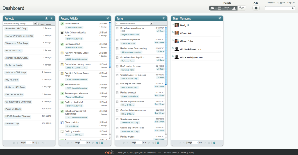
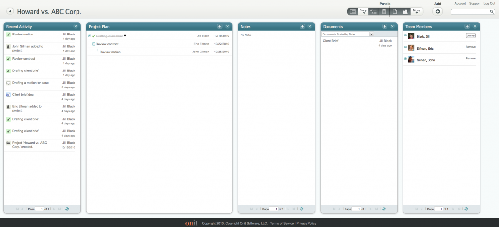
The new design uses a series of “swim lanes” to show the various types of information available on Onit. While the page header and footer remain fixed, the workspace in the middle of the screen can be expanded or contracted to suit your needs. Each “lane” can be opened or closed and additional lanes can be added. They fit vertically on your screen, so no up-and-down scrolling is required. If you add more boxes than fit on your screen, you can scroll horizontally. Boxes can be open and closed with a quick click.
The first screencap of the new interface shows the new dashboard — the first screen you would see after logging in. Current projects are listed in a box to the left. These can be sorted by name or activity and also tagged. The next box lists all recent activity on all projects, with icons that indicate the type of activity. The next two boxes list tasks and team members.
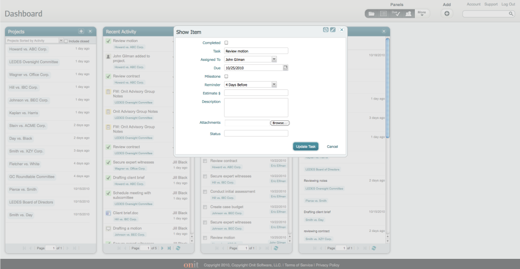
As Onit is currently configured, it is necessary to drill down into each of your projects in order to work with tasks, notes, documents and other features of Onit. With the new interface, all of this can be done from the dashboard. Click a task, for example, and it opens directly from the dashboard.
Onit retains the features I described in my earlier post, such as the ability to “nudge” team members, to add notes and updates using a special e-mail address, and to follow projects using RSS feeds. A user can set notification preferences to be sent an e-mail each time a project is updated or as a daily digest of updates.
Notably, Onit remains free to use. “There will always be a free version,” Elfman told me. In November, Onit will roll out a paid, premium version aimed at large, enterprise-level users, such as corporate legal departments. Other paid versions are planned for next year. But for modestly sized projects, the free version will remain.
I sometimes hear lawyers complain about applications that take a one-size-fits-all approach to their design. The new Onit workspace is appealing for its fluidity and ability to be customized. It lets the user choose which information is important to view and it then presents that information in a visually direct format.
[Disclosure: Onit is currently a paid advertiser on this blog. It was not an advertiser when I first reviewed it in March.]
 Robert Ambrogi Blog
