I am at the Clio Cloud Conference in Chicago today, where Clio, the cloud-based practice-management platform, is announcing the launch of its all-new app for iPhones and iPads. I’ve had a few days to try out a beta version, and I have to say that Clio’s iPhone app is the most highly functional and highly intuitive practice-management app I’ve seen.
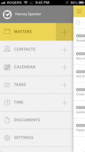
The app literally puts all the key aspects of your practice at your fingertips. Swipe right to access a menu of all your matters, contacts, calendar entries, documents and other items. Swipe left to enter time, see upcoming appointments and tasks, and access recent matters. Pop-up shortcuts make it easy to initiate an email to a contact or add a calendar item to a matter.
All of this is achieved in an app that is also visually appealing, using design elements that help highlight important features. Everything is organized over a three-panel layout. Swipe to the right to bring up the left panel, where you can select to view matters, contacts, calendar, tasks, time and documents. Whatever you selected appears in the center panel.
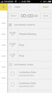
Swipe left to display the right panel, which Clio has dubbed the “Awesome Bar.” It includes an integrated timer that, once started, continues to display in the top bar as you move to other functions in the app. This panel also shows upcoming events and tasks and provides shortcuts to matters you’ve most recently worked on.
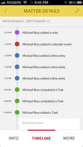
Each matter includes a timeline that displays the full history of activity on that matter. Click on any matter in the timeline to view or edit it.
The app lets you access Word and PDF documents that you’ve stored with Clio. You cannot edit documents within the app.
 Robert Ambrogi Blog

