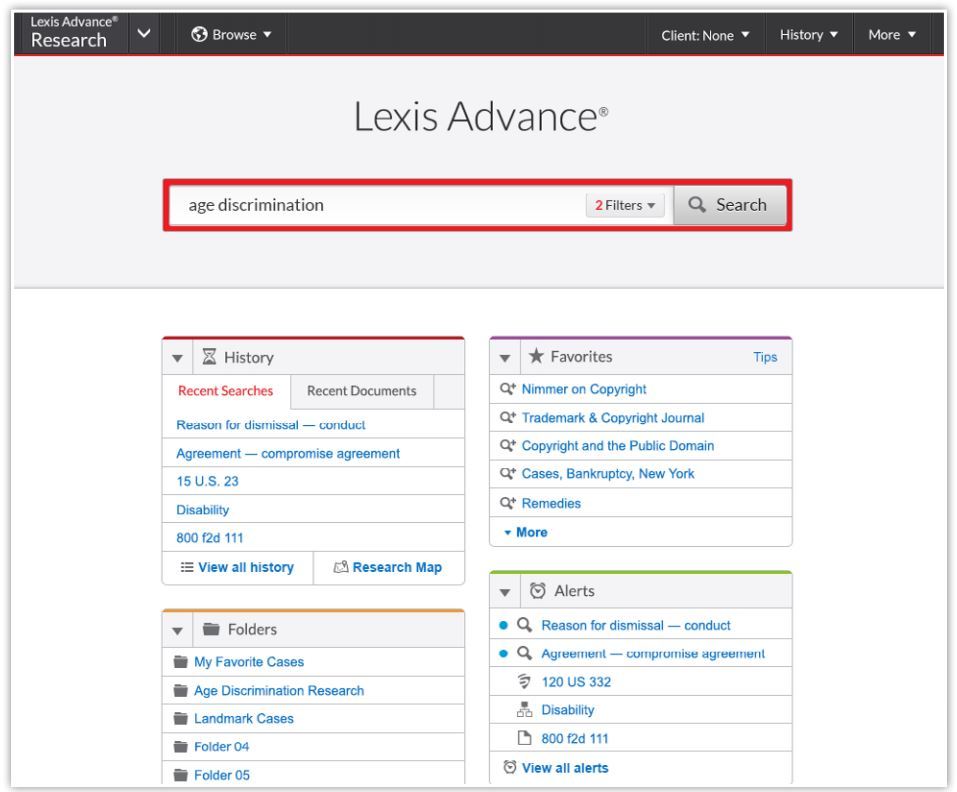
The official theme of the American Association of Law Libraries annual meeting in San Antonio this week was “Beyond Boundaries.” But for three of the leading legal-research vendors in attendance there, the theme was “A Change is Gonna Come.” Both Lexis Advance and Wolters Kluwer officially previewed major overhauls of their user interfaces. Fastcase is not yet ready to go public with its changes, but CEO Ed Walters did give me a private preview of what is to come.
The Fastcase redesign will be released this fall in private beta for select users. The full production version is slated for release early next year. In San Antonio, Walters gave me a preview of the new design on the condition that I keep the details private for now, so I cannot tell you much about it. I previously published some details in a piece I wrote for the ABA Journal about visual law:
Fastcase is preparing to release a new version of its platform that will give visual search even greater prominence. In the new version, the Interactive Timeline will appear on the same page as the search results rather than on a separate page. The results page will also display a tag cloud, showing the words and concepts that are most prominent in the cases within the search results.
That much remains true and I can say that I was impressed with what Fastcase is planning to roll out. For now, I’ll have to leave it at that.
Lexis Advance Advances
Meanwhile, LexisNexis is making no secret of its forthcoming redesign of Lexis Advance. It was touting the redesign all over its booth in the AALL exhibit hall and it even threw a Lexis Advance release party. That said, the redesigned platform will not actually be available to customers until late this summer.
During AALL, I had a chance to meet with Marty Kilmer, vice president of product platforms at LexisNexis, who showed me some of the forthcoming changes to Lexis Advance. The goal of the redesign, he said, was to make the platform quicker and easier to use, while not abandoning any features or functionality.
To achieve that, Lexis Advance has eliminated tabs and reorganized content in order to cut down the number of clicks required to find content and perform common tasks. The main search bar is simplified, with no source selection required to search. Searching for a specific type of content — a case name, a citation, a source such as Collier — requires only typing the name.
The main search page has been changed to add “pods” that provide quick access to the user’s history, folders, favorites and alerts, as well as to help topics. Also from the main page, searches can be refined and filtered in advance, to limit them by jurisdiction category, practice area and other facets. As you add filters, they are displayed on your screen, and any filter you’ve added can be removed with a click.
You can also browse sources from the main search page. You can find sources by typing their name or by typing the concepts or jurisdictions you are researching.
Search results show results across all types of categories, but you can easily narrow results to cases, statutes or other content types by clicking on the left of the screen. A new Snapshot view shows the most relevant results on a single screen. When you select a case from the search results and view it, a Shepard’s summary is shown on the same page; click it to go to the full Shepard’s report.
Lexis has posted a page with videos and guides that provide more information about the changes to Lexis Advance.
Wolters Kluwer Cheetah
Also at AALL, Wolters Kluwer was touting its forthcoming redesign, dubbed Cheetah. It will have a limited release to select users in August and a commercial release in November. To begin, the new platform will be available only for securities law, with coverage of three overarching areas: governance and compliance, litigation and enforcement, and transactions and activities. Other topic areas will be rolled out subsequently.
The new platform has been engineered to maximize speed and ease of use, product manager Scott Murray told me during a demonstration at AALL. The design is responsive, so that it will work equally well across platforms, whether on a computer, a table or a mobile phone.
Cheetah uses a three-panel display. All the primary content is shown in the center panel. A left-side panel shows the user’s saved searches, favorites and alerts. As you search, the panel shows facets that the user can select to narrow and refine the search. The far-right panel will provide direct links to practice tools.
I had only a brief preview of Cheetah at AALL but I hope to have a more in-depth look sometime soon. Last December, Jean O’Grady published a fairly detailed preview of Cheetah at Dewey B Strategic, and from what I saw at AALL, her description of forthcoming features remains accurate.
 Robert Ambrogi Blog